I participate in the Birthday Swap on my fabric postcard group and I created this one for my next swap partner.
I have had this house concept in my head for a while now and the paper piecing I did for my last swap encouraged me to give it a try and see how well it would work.
I started with the house rectangle and then found a triangle which would work for the roof. Next I found some blue pieces that I could use for the sky and the floral greenery fabric for the background landscape around the house. I found a pieced length of browns for the foreground. It was a bit short so I added another length of brown brick looking fabric. I started by stitching the sides (greenery to blue sky) to each other and then I stitched them to the house. I positioned the roof over the large sky rectangle and stitch it to the house with the sides. Next, I stitched the brown piece to the pieced one and then stitched this large piece to the bottom of the house rectangle I had just created. I ironed all my seams and then trimmed the whole thing to 6" x 4". I added iron fusible webbing to the back of the roof and ironed it into place added hand stitching to it afterwards. I found a small dark red scrap to use as my front door, added fusible webbing to the back and ironed it into place. I stitched all the way around using black floss, added a yellow half moon window and hand stitch around it with yellow floss. I added a small gold sequin with a large french knot to create the doorknob. I added some hand stitched flowers on either side of the house as well. I stitched batting to my white backer, layered on my front and then stitched all the way around to attached all the layers to each other. I created a chain of single crochet stitches using textured dark green yarn and stitched to the each of my postcard using dark green floss in an over hand stitch. To finish off my postcard I used a small piece of fusible fabric, added my handwritten message using a permanent marker and ironed it into place above the door. Pretty happy with how this one worked out!! Looking forward to trying this design out again with different colours. Therese
Showing posts with label hand lettering. Show all posts
Friday, December 22, 2017
Thursday, June 22, 2017
Smash Journal for The Woman Unleashed Retreat
I found a link to The Woman Unleashed - an online retreat on Linda's blog so I followed it and decided to participate. The first activity is to make a smashed journal in which to record your insights as you participate in the different parts of the retreat. So this evening I decided to create my journal. One of the most significant comments on the video was that creating this journal was more about the process - what was speaking to you - rather than creating art. So it is about YOU - what is calling you, what do you like, how do you feel and taking the time to really connect with your inner self so you can bring about the transformation that you intend.
I remembered having a blank book years ago and went on the hunt to find it amid the boxes in my studio!! After a few, I started praying for guidance because there are a LOT boxes in my studio and instead of finding the book I was looking for I found a stack of kraft pages that at one point had been bound but were no longer. I took it as a sign and decided to make covers for this stack of pages.

I have LOTS of different papers in my studio and could have used any of them to cover the cardstock covers I had created but I felt called to use the paper from this flour sack instead. It speaks to me of health and making good choices for wellness. So I cut open the bag and smashed the paper over and over again until it was nicely wrinkled and had lots of texture. I trimmed two pieces the right size to cover my covers which I cut pretty much the same size as my pages and glued the brown paper to my bright yellow covers. I really like the bright yellow and the cardstock is a reminder to me of the beginning of my journey into art.

I used an old gift card and glue from my little pot of glue stick leftovers to adhere my paper to my covers. I trimming the corners and the edges to leave an even margin on the inside.
Here you can see my two finished covers and the stack of pages. I used the stack to make holes in the covers using my awl. The covers fit really well on my stack of pages. I decided to use elastics to bind my journal because they will allow my journal to lay flat by stretching the bit that is require for that action to take place. I used my awl to enlarge the holes sufficiently to allow the elastics to slide right through. I tied the short pieces using square knots on the spine.


We were also encouraged to smash all of our pages - just crunch them up!! After crunching you can see that my journal has become a little thicker!! I am really happy with how my journal turned out but it still needs ribbon and some scent which I will add later once it is dry. I am looking forward to the next activity on this retreat!!
I hope you will consider joining the retreat and taking the challenge to unleash what you want into your life!! Remember you create in your life using your thoughts, your words and your actions!! Choose wisely!!
Therese
I remembered having a blank book years ago and went on the hunt to find it amid the boxes in my studio!! After a few, I started praying for guidance because there are a LOT boxes in my studio and instead of finding the book I was looking for I found a stack of kraft pages that at one point had been bound but were no longer. I took it as a sign and decided to make covers for this stack of pages.

I have LOTS of different papers in my studio and could have used any of them to cover the cardstock covers I had created but I felt called to use the paper from this flour sack instead. It speaks to me of health and making good choices for wellness. So I cut open the bag and smashed the paper over and over again until it was nicely wrinkled and had lots of texture. I trimmed two pieces the right size to cover my covers which I cut pretty much the same size as my pages and glued the brown paper to my bright yellow covers. I really like the bright yellow and the cardstock is a reminder to me of the beginning of my journey into art.
I used an old gift card and glue from my little pot of glue stick leftovers to adhere my paper to my covers. I trimming the corners and the edges to leave an even margin on the inside.
Here you can see my two finished covers and the stack of pages. I used the stack to make holes in the covers using my awl. The covers fit really well on my stack of pages. I decided to use elastics to bind my journal because they will allow my journal to lay flat by stretching the bit that is require for that action to take place. I used my awl to enlarge the holes sufficiently to allow the elastics to slide right through. I tied the short pieces using square knots on the spine. 
We are encouraged to set an intention for the retreat so I decided to journal about my intention on the front of my journal. Using a fine tipped Sharpie I started writing and just joined all of my words and sentences into multiple lines of writing until I had filled the whole cover leaving a bit of a margin all the way around. Next, I decided that I would doodle a border in that space. After my doodling I was still feeling inspired to journal my intention so I flipped my journal and continued to write going across the writing I had already put on the front. That felt better and I like the wonderful texture that it gives my front cover.
As I finished up the last of my journaling on the cover I felt I needed to refine what I intended into a short phrase. In the end, I decided on two which when I had finished adding them to my cover worked together quite well. I found the letters for "voice" and "prayer" in my letters stash - a little plastic container in which I put all the letters which are leftover from any of my creative projects. Once I had them arranged the way I liked them I adhered them with white glue. I like that they are sort of random and not perfect. It was great that they were colourful as well. I found my creative writing book and added the rest of the words using the fine tip Sharpie I used for journaling and a bullet tipped one I had in my stash. It was fun to use different letter styles for each word. The border was calling out for colour so I started with gel pens and it was not quite the look I was wanting so I dug out my watercolours and painted it in with them!! Watercolours are my favorite!! We were encouraged in the video to gild the edges of our pages so I did mine in purple!!


We were also encouraged to smash all of our pages - just crunch them up!! After crunching you can see that my journal has become a little thicker!! I am really happy with how my journal turned out but it still needs ribbon and some scent which I will add later once it is dry. I am looking forward to the next activity on this retreat!!
I hope you will consider joining the retreat and taking the challenge to unleash what you want into your life!! Remember you create in your life using your thoughts, your words and your actions!! Choose wisely!!
Therese
Friday, March 10, 2017
Fabric postcard with a geometric pattern and hand stitching
I am part of a birthday swap on my fabric postcard group - Trading Fabric Post Cards. I have seen cards where the shapes of the images in the fabric have been hand embroidered so I decided I would try that on this one. The fabric has geometric patterns and elements and a wonderful colour combination of red, purple, sienna and turquoise with a bit of blue and black!! You can see below a before shot of the fabric - the strip is printed and part of the fabric. I wanted it to be highlighted so I added an extra layer of batting just behind the strip and stitched it into place before stitching the same size piece of batting to the front of my postcard.
With the batting in place I started adding hand stitching - first around all the elements in the areas above and below the strip. I took same colour embroidery floss and did running stitch around all of the elements doing all one colour at the time starting with the black, then the purple, turquoise, blue and finally the yellow. I wanted to highlight the red area as well so I just added short tiny stitches randomly in all of those areas. I like the texture that the hand stitching provides!! Next, I added hand stitching to the squares in the strip. In this area I added hand stitching in a different colour than the printing. For example on the black center elements I used red and purple to highlight them. I used the those same colours on the outside borders and in the black corner elements as well. Lastly, I added yellow to the corners of all the squares. Wanting to bling it up a bit I added sequins in the center of the squares which I just stitched in place using large french knots. As I was stitching I was thinking of a theme regarding having special days. I was inspired to make one of the squares a gift by stitching a gold ribbon to the top to simulate a bow and to add the quote which reads" today - the present". The squares reminded me that often every day looks very much like the one that came before with a few changes. We get to choose to see it as "the present" that it is and certainly when we celebrate a birthday we get to make it special by adding to it activities, people and things that have meaning for us. The quote is hand written on iron on fabric label tape, coloured with watercolour and ironed into place below the gift. To make the bow, I simply folded gold ribbon to make a V and stitched it into place above the square that became the gift. I added a white backer to which I had stitched some pellon and stitched my front and back together very close to the edge all the way around. I braided three lengths of black fiber and used black thread in a zig zag stitch to finish off my post card. I am pretty happy with it!! Very different that some of the others I have created. You can check them out here. This one is off to my partner to arrive before her March birthday. Therese
Monday, March 06, 2017
Fabric postcard featuring candles and paper beads
A fabric postcard for the birthday swap on my Trading Fabric Post Cards group. I love how this one turned out!! I started with some fabric that I coloured with wax crayons. After ironing it very thoroughly I was able to get most of the wax out yet it left pretty much all the colour. You can check out the fabric I painted here. I cut a piece that was 6" wide and then went looking for a fabric that coordinated. I found this striped fabric scrap that was perfect!! I trimmed the striped fabric to 6" as well and stitched them together. I did find that my sewing machine had a bit of trouble with the waxed fabric - it was having difficulty feeding it through so it might have been better had I used the waxed fabric on the top instead of the bottom. Something to watch for next time! I decided that the stripes looked like candles and that would be most appropriate for a birthday post card. I added a small piece of batting to the back and stitched all the stripes individually to give "the candles" definition. I added Heat and Bond to the back of a small piece of yellow fabric and hand cut 11 little candle flames - one for each candle. I wondered whether there would be any problem getting the heat and bond to adhere to the waxed fabric but there was no problem. I ironed them all into place and used a fine tip permanent marker to add a wick to each one. To give them a bit of dimension I used an orange watercolour pencil to add a bit of colour and then used a small wet brush to soften the colour and spread it out a bit. I stitched the silver ribbon over the bottom section and applied my hand lettered & watercoloured quote over it. I created it from iron fabric label tape so it simply needed to be ironed into place. I added two sequins on either end keeping them in place with large french knots. I thought it still needed a bit of something so I used light yellow floss and running stitches to create light rays around my flames It added texture and did pretty much what I had hoped it would. On hind sight, I wish I had added some sewing machine stitching to the bodies of the candles as they are quite plain. They could have used some texture as well but with the ribbon & quote in place it was not convenient to make that happen. With the hand stitching done I created a backer from white fabric and creatively stitched some batting to it using my sewing machine. I put my back and front together and stitched all the way around close to the edge. Once I decided on my edge treatment I realized that it would have been more appropriate to have used coloured thread to stitch all the way around so I used a marker and ruler to carefully apply colour to the white thread to tone it down a bit. Worked quite well!! I decided to use the paper beads that I created a while back in my edge treatment. I cut them in half, covered them in coordinating decorative paper and then included them along with some pink E beads when I blanket stitched all the way around. It was nice to be able to use a larger needle with fine crochet thread on this piece as it easily managed the holes in the Ebeads and the paper beads.
As I was creating I reflected on my quote - "shine your light". We are only ones who can shine our light - no one else can do it for us!! We have the ability to choose to shine bright or not. We can only be perfectly ourselves because we have a unique set of talents and abilities which cannot really be compared to those of others. I hope my swap partner will see that we are more the same than not but being different makes us unique and that is worth celebrating especially on our birthdays.
Therese
As I was creating I reflected on my quote - "shine your light". We are only ones who can shine our light - no one else can do it for us!! We have the ability to choose to shine bright or not. We can only be perfectly ourselves because we have a unique set of talents and abilities which cannot really be compared to those of others. I hope my swap partner will see that we are more the same than not but being different makes us unique and that is worth celebrating especially on our birthdays.
Therese
Friday, February 03, 2017
Two love birds framed in floral paper for Valentine's
Valentine's is coming fast and I have made another card for my stash! This one features a love bird image which I downloaded from Paper Crafts Magazine a while back. I started with my decorative paper frame which I used on my class cards - four strips of gift wrap neatly cut to make a nice frame on an A2 sized card. I cut a piece of black cardstock to fit inside (2.25" x 3.5"), added my watercoloured image then added faux stitching around the edge using a white gel pen and hand lettered the little greeting. I glued this to the inside of my frame to finish off my card. We all know couples who immediately come to mind when we hear a reference to "love birds". A perfect card for them!!
Therese
Therese
Labels:
A2,
cards,
digital images,
faux stitching,
gel pen,
gift wrap,
hand lettering,
laser printing,
Valentine's,
watercolour
Monday, November 21, 2016
Butterfly Wishes fabric postcard
Another birthday postcard for my birthday swap on one of my groups. I had three little squares of pieced green fabric which coordinated with the butterfly really well so I went looking to find another piece that worked with both of them and found this beautiful scrap of red!! Perfect!! I sewed the three little green squares to each other to create a strip, sewed on the scrap of red and trimmed out a 4" x 6" piece for the front of my postcard. Next, I searched for a piece that coordinated for the back which was big enough to come to the front as a binding. I cut this backer from a larger piece of fabric but I love the way it coordinates with all the pieces I had already chosen. I added fusible web to the edges of my backer and trimmed it to be wavy. I cut and laid down a piece of batting and positioned my front over it and pinned them all together. I put red thread on the top and yellow in my bobbin and stitched an all over wavy design to connect all the pieces and provide some stability for the postcard. I trimmed the corners out, folded the sides to the front and ironed them into place. I couched some deep yellow yarn with a zig zag stitch over the wavy edge of the binding using the same red and yellow thread. Like how that worked out! I positioned my butterfly - a self adhesive fabric embellishment - on the front, drew a flight line which I embroidered with gold thread before adhering the butterfly in place. I used a marker to add "Buttefly Wishes" in red. It will be winging its way to my partner this week!!
Therese
Therese
Monday, August 31, 2015
Heart fabric postcard
On my TFPC group I have joined a no theme postcard swap for August. I have Traci Bautista's Collage Unleashed book out of the library and saw that she had created one of her backgrounds using little strips of fabric. Having seen a bag of fabric strips at the second hand store a while back I went back to see if it was still there. Yes, it was!! I brought it home, ironed all the little strips and choose several that coordinated to create my first background. I have no idea what these would have been cut up for but they were perfect for this technique.
I started with a scrap piece of fabric. It doesn't matter what it looks like because it will all be covered up. I adhered my strips to my base fabric using "no sew hem tape" which is just heat and bond fusible web in a strip which worked perfectly!! I cut a strip of no sew tape for each strip and layered them onto my base fabric then passed the iron over it which fused it in place. Repeated until the whole surface had been covered. Next, I added a 4"x 6"piece of batting to the back and used red thread in my sewing machine to randomly sew all over the surface which bound all the layers to each other. I added a fabric heart which I stitched in place using several colours of thread and then added black stitching all the way around it as well. I added a white backer, folded it to the front and stitched all the way around to finish it off. It still needed a bit of something so I ironed on a little strip of label tape on which I had written "Love is kind". Perfect!! I added postcard details to the white back using a black sharpie and it is ready to be mailed off to my partner.
I am really enjoying making these little fabric projects!! This one is a little more textured because the edges are left just cut but that is the way it is with love and life - it is always beautiful but a little more textured in some cases.
Therese
Friday, August 21, 2015
Raised N postcard with a twist
We have an ongoing swap on one of my groups - postcards with raised letters. I thought I would give "raised" a bit of a twist and created a postcard where you raise the N using a ribbon!! Very cool technique I have in the past used with tags and cards. I created the front on blue cardstock by first drawing wavy lines in pencil and tracing them using a fine tip black sharpie. I punched the hole for my ribbon, drew in my letters, filled them in and then zentangled the rest of the spaces. I added the foil elements with a bit of a black strip of cardstock to set them off from the artwork. I created my back on green cardstock - just postcard elements hand drawn along with my swap information.

Next, I created my N. I started with a small piece of alcohol ink background that was the right colour, hand wrote "never" all over the front and then hand drew the N and filled it in. I ran a large black marker around the edge just to give it a bit of definition. I then created the U I needed to hold my N between both layers and glued the front to the back using double sided tape which left a pocket in the middle which will hide my N until someone pulls on the ribbon. As you pull on the ribbon the N element slowly rises!! Very cool!! You can find a tutorial for the pull up mechanism here on SplitCoast Stampers. It will be off to my partner in the next few days!!
Therese

Next, I created my N. I started with a small piece of alcohol ink background that was the right colour, hand wrote "never" all over the front and then hand drew the N and filled it in. I ran a large black marker around the edge just to give it a bit of definition. I then created the U I needed to hold my N between both layers and glued the front to the back using double sided tape which left a pocket in the middle which will hide my N until someone pulls on the ribbon. As you pull on the ribbon the N element slowly rises!! Very cool!! You can find a tutorial for the pull up mechanism here on SplitCoast Stampers. It will be off to my partner in the next few days!!
Therese
Wednesday, August 19, 2015
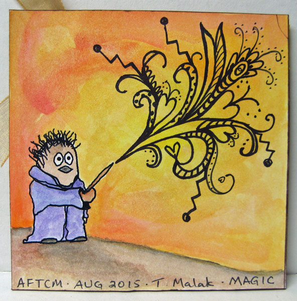
Magical 4x4 chunky book page!
On one of my groups I joined a 4" x 4" chunky book swap with the theme of magic and the colour orange!! I did a bit of brainstorming, sketched a layout and went looking for what I would need to create it!! I found the book of spells on line on a geocaching site. It was exactly what I was looking for - a beautifully illustrated book with a orange undertone. I found the bottle on CLKER and added the label which I also found somewhere on line. Perfect!! I imported the book in Corel Draw after I had made a few modification in PSElements to give it more height. I imported the bottle as well after I had added the label in PSElements. While looking for elements I had found an illustration of a little magician spewing magic so I decided I wanted something similar on the back of my page. I downloaded this little guy (b&w) from CLKER and modified it in PSElements changing the eyes, hair, mouth, position of the arm and added a wand.

I positioned everything in Corel Draw and then laser printed it on white cardstock. I trimmed it to be 4" x 8" and folded it in half. I trimmed my bottle close and then ran a black sharpie around the edge to remove the white shadow. I watercoloured the bottle and then applied glossy varnish to give it it a shiny finish. I rounded the edges a bit and mounted it to the front of my 4x4 using 3D foam tape. I felt like the page needed a bit more texture so I added an orange organza ribbon to the top. That was better!! I added some hand lettering and it was done! On the back, I watercoloured the whole thing - the background in yellow and orange, the hill in browns and the wizard in purple. He is a bit strange looking but I like him. I have very little experience in digital drawing. Once it was dry, I sprayed it with hair spray to seal the surface so I could add my magical zentangle. I used a fine tip sharpie for the zentangle and just kept adding until I thought it was finished. There are a few hearts in there because it is Love Potion after all!!! Super happy with the result of my experimenting!!!
This little chunky book page will be off to my partner next week!!!
Therese

I positioned everything in Corel Draw and then laser printed it on white cardstock. I trimmed it to be 4" x 8" and folded it in half. I trimmed my bottle close and then ran a black sharpie around the edge to remove the white shadow. I watercoloured the bottle and then applied glossy varnish to give it it a shiny finish. I rounded the edges a bit and mounted it to the front of my 4x4 using 3D foam tape. I felt like the page needed a bit more texture so I added an orange organza ribbon to the top. That was better!! I added some hand lettering and it was done! On the back, I watercoloured the whole thing - the background in yellow and orange, the hill in browns and the wizard in purple. He is a bit strange looking but I like him. I have very little experience in digital drawing. Once it was dry, I sprayed it with hair spray to seal the surface so I could add my magical zentangle. I used a fine tip sharpie for the zentangle and just kept adding until I thought it was finished. There are a few hearts in there because it is Love Potion after all!!! Super happy with the result of my experimenting!!!
This little chunky book page will be off to my partner next week!!!
Therese
Friday, July 17, 2015
Mixed Media fabric wall hanging with a quote
I have finally finished my wall hanging. It has taken longer than I expected but there were several times in the creative process that I had to wait for inspiration to come. That is as it should be!!
I started by sewing blue, pink and patterned fabric scraps together to create a panel in a bit of a log cabin style layout. Next, I played with a variety of elements to see how and what I would use to create my piece. I eventually decided to add my quote to a non running fabric (Windex wipes) using a fine tip Sharpie. I printed rhw quote onto paper and was able to see it well enough thriough the fabric to trace it. I trimmed the edges of the fabric, stitched it to my panel and then used the overcast stitch with black embroidery thread to secure a larger fiber over the machine stitching. Two squares seemed quite jarring - they were pretty much too light for the rest of the piece so I watercoloured them in blue, masked them off and added stippling in navy ink. That toned them down considerably. I started auditioning trims and eventually chose the two pieces of cotton eyelet lace and the pink fabric trim. The pink was not quite the right colour so I added a red acrylic paint colour wash. That was better. I sewed on all the trim using white thread in my sewing machine. To add yet more texture I added some white hand stitching over the pink trim adding pink and white glass seed beads as I went. That worked out very well. Knowing that I wanted to add some floral elements I auditioned some silk flowers and really liked these blue ones. I added blue flower sequins to their centers, some silk leaves in behind and added a tiny yellow seed bead to the center as I stitched them into 3D embellishments. Next I played with placement of my flowers until I was happy with the layout. Two of the smaller ones were used to disguise the two squares that had been toned down as they still contrasted too much with the rest of the piece. That worked out well. Before sewing on my flowers I played around with how I would finish off the edges of my hanging. I finally decided to lay the front face down on the back and stitched around the edge leaving a gap to turn the whole thing inside out. I did remember to add two white bias tape loop hangers to the top before I stitched it up. Very happy with how that worked out!! I stitched up the gap, pressed everything very well and added a row of machine stitching all the way around the edge which stabilized it very nicely. As I was getting ready to add my flowers I decided that the quote needed to have some flowers on it. I dug through my stamps and found this doubled ended flower stamp (SU). I coloured the areas with markers, huffed on it and stamped them in place - one on the left and the other on the right. To add texture, I added french knots to the flower centers. Very happy with that!! Next, I thought maybe the back and the front needed to be attached more closely than only on the edges so I added hand stitching (not all the way through) to all the pieces generally adding thread in the same colour as the fabric was printed so that the only effect I created was texture on the fabric. I added pink french knots to the little roses on the fabric on the left hand side. I like the way that turned out! Finally it was time to sew on my flowers!! I stitched them on by hand using yellow embroidery thread. The result did not please me as much as I had hoped it would. It still needed a bit of something!!! I auditioned a wide variety of options and finally settled on leafy green cardstock die cuts. I watercoloured them with yet more green, dried them and moved them around my flower until I was happy with the layout. I took a photo with my camera to use as reference before I stitched them around my flowers. That was much better!!!
Here is a photo of the first one I made where I used much more of a collage technique.
Here is the back of my wall hanging. It features hand painted fabric which I made myself. I started with a piece of white cotton to which I applied several colour washes of acrylic paint in pink and blue. Once dry, I added a layer of batting which I stitched into place using blue thread in a diagonal grid pattern. I added white dots to each space using acrylic paint and a little round foamie dot. I added four blue loops at every other intersection and pink french knots in between. I had made it large enough so I could just fold over the edge and stitch it in place had I decided to finish it off that way.
I am happy with my wall hanging!!!! I will be writing my credits on white cotton, stitching it to the back then packaging it up and it will be off to my swap partner on Monday!!
Therese
I started by sewing blue, pink and patterned fabric scraps together to create a panel in a bit of a log cabin style layout. Next, I played with a variety of elements to see how and what I would use to create my piece. I eventually decided to add my quote to a non running fabric (Windex wipes) using a fine tip Sharpie. I printed rhw quote onto paper and was able to see it well enough thriough the fabric to trace it. I trimmed the edges of the fabric, stitched it to my panel and then used the overcast stitch with black embroidery thread to secure a larger fiber over the machine stitching. Two squares seemed quite jarring - they were pretty much too light for the rest of the piece so I watercoloured them in blue, masked them off and added stippling in navy ink. That toned them down considerably. I started auditioning trims and eventually chose the two pieces of cotton eyelet lace and the pink fabric trim. The pink was not quite the right colour so I added a red acrylic paint colour wash. That was better. I sewed on all the trim using white thread in my sewing machine. To add yet more texture I added some white hand stitching over the pink trim adding pink and white glass seed beads as I went. That worked out very well. Knowing that I wanted to add some floral elements I auditioned some silk flowers and really liked these blue ones. I added blue flower sequins to their centers, some silk leaves in behind and added a tiny yellow seed bead to the center as I stitched them into 3D embellishments. Next I played with placement of my flowers until I was happy with the layout. Two of the smaller ones were used to disguise the two squares that had been toned down as they still contrasted too much with the rest of the piece. That worked out well. Before sewing on my flowers I played around with how I would finish off the edges of my hanging. I finally decided to lay the front face down on the back and stitched around the edge leaving a gap to turn the whole thing inside out. I did remember to add two white bias tape loop hangers to the top before I stitched it up. Very happy with how that worked out!! I stitched up the gap, pressed everything very well and added a row of machine stitching all the way around the edge which stabilized it very nicely. As I was getting ready to add my flowers I decided that the quote needed to have some flowers on it. I dug through my stamps and found this doubled ended flower stamp (SU). I coloured the areas with markers, huffed on it and stamped them in place - one on the left and the other on the right. To add texture, I added french knots to the flower centers. Very happy with that!! Next, I thought maybe the back and the front needed to be attached more closely than only on the edges so I added hand stitching (not all the way through) to all the pieces generally adding thread in the same colour as the fabric was printed so that the only effect I created was texture on the fabric. I added pink french knots to the little roses on the fabric on the left hand side. I like the way that turned out! Finally it was time to sew on my flowers!! I stitched them on by hand using yellow embroidery thread. The result did not please me as much as I had hoped it would. It still needed a bit of something!!! I auditioned a wide variety of options and finally settled on leafy green cardstock die cuts. I watercoloured them with yet more green, dried them and moved them around my flower until I was happy with the layout. I took a photo with my camera to use as reference before I stitched them around my flowers. That was much better!!!
Here is a photo of the first one I made where I used much more of a collage technique.
Here is the back of my wall hanging. It features hand painted fabric which I made myself. I started with a piece of white cotton to which I applied several colour washes of acrylic paint in pink and blue. Once dry, I added a layer of batting which I stitched into place using blue thread in a diagonal grid pattern. I added white dots to each space using acrylic paint and a little round foamie dot. I added four blue loops at every other intersection and pink french knots in between. I had made it large enough so I could just fold over the edge and stitch it in place had I decided to finish it off that way.
I am happy with my wall hanging!!!! I will be writing my credits on white cotton, stitching it to the back then packaging it up and it will be off to my swap partner on Monday!!
Therese
Friday, January 16, 2015
Postcard - Traci Bautista style
Here is the postcard I mentioned here!! I am super happy with how it turned out as it is my first attempt at doing the Traci Bautista style of art. I used the hot glue stencils I made the other day - they were really fun to play with. I watched several of Traci's videos on line so I could get a feel for how she did her layers and what supplies she used. Most of the videos are in "quick mode" so I had to really pay attention to figure out what supplies she was using and how she was using her tools.
I started by creating my background on glossy photo paper. You can check below for more information. Once I was happy with it I found a bright piece of hand decorated paper in my stash and punched six ovals (SU) from different areas of it to get a variety of colours. I used a red stamp pad and a Making Memories magnetic alphabet set to add the words to the petals - life, thoughts, words, deeds, kindness, joy. I used a red gel pen to add a squiggly border to each petal. I created the flower center by layering a red scallop outline over a yellow scalloped circle and layered a C over it. The C was created by cutting two neighbouring circle Nestibilities out of yellow cardstock which created an O. I then trimmed out a section to create the C and added an outline filled with cross hatching using the red gel pen. I eventually added red watercolour pencil and used a wet brush to push it around to get a more solid shape. I hand lettered the rest of the letters to spell "Choose" and once it was dry I spritzed it with yellow ink spray. I hand cut the leaves and stem from a piece of green hand decorated paper and added some definition with a green watercolour pencil blending out the colour with a wet paintbrush. After positioning all the elements I glued the petals, stem and leaves in place using white glue in a fine tip applicator and added the flower center over them using a small square of 3D foam tape.
So here is what my side table looks like after a stint of playing with ink sprays and hot glue stencils. I created sprays by mixing a few drops of dye reinkers with water in little TH misters. That worked great. I ended up using navy (Night of Navy), medium blue (Brocade Blue), red (Real Red) and yellow (Crushed Curry) (SU) for my creations. You can see in the photo the first three backgrounds I created and how much paper I had down to catch the over spray (those will eventually have more colour added and be added to my hand decorated paper stash). The first one - yellow & blue - the blue was too dark. The other two were too close to the colour of the flower petals to be effective backgrounds. The lighter blue was a much better choice. I laid several stencils over my 4" x 6" glossy photo paper and spritzed it a couple of times with the medium blue spray. I removed those stencils and added others and added a couple spritzes of yellow. When I removed those stencils I turned them over, spritzed their flat backs with yellow and laid them on the corners of my developing background. I was happy with that. Next, I turned another stencil over, spritzed it with blue and laid it over my background, repeated the spritzing and laid it in a different place. That was better. I was quite happy with the results and the contrast between it and the bright petals was really good, but it still needed a bit of something. I decided it needed a bit of red/pink. I knew that spraying the red would be too dark so I punched an eyelet border (SU) out of white cardstock hoping to use it like a stamp. It was very porous and immediately absorbed all the colour I had spritzed it with. Bummer!! I kept experimenting and eventually discovered that once it was saturated with colour I could use it like a stamp - perfect. I just laid it over my background in three places and rubbed the back to transfer the ink. That worked very well and gave me the more subtle colour I was looking for. I have resisted adding any black to this piece of art mostly because I did not want to ruin it and also to let myself just appreciate the colours for what they are though I may consider just a few drops of black ink spritzed in a few spots from the bristles of a toothbrush!!
Therese
I started by creating my background on glossy photo paper. You can check below for more information. Once I was happy with it I found a bright piece of hand decorated paper in my stash and punched six ovals (SU) from different areas of it to get a variety of colours. I used a red stamp pad and a Making Memories magnetic alphabet set to add the words to the petals - life, thoughts, words, deeds, kindness, joy. I used a red gel pen to add a squiggly border to each petal. I created the flower center by layering a red scallop outline over a yellow scalloped circle and layered a C over it. The C was created by cutting two neighbouring circle Nestibilities out of yellow cardstock which created an O. I then trimmed out a section to create the C and added an outline filled with cross hatching using the red gel pen. I eventually added red watercolour pencil and used a wet brush to push it around to get a more solid shape. I hand lettered the rest of the letters to spell "Choose" and once it was dry I spritzed it with yellow ink spray. I hand cut the leaves and stem from a piece of green hand decorated paper and added some definition with a green watercolour pencil blending out the colour with a wet paintbrush. After positioning all the elements I glued the petals, stem and leaves in place using white glue in a fine tip applicator and added the flower center over them using a small square of 3D foam tape.
So here is what my side table looks like after a stint of playing with ink sprays and hot glue stencils. I created sprays by mixing a few drops of dye reinkers with water in little TH misters. That worked great. I ended up using navy (Night of Navy), medium blue (Brocade Blue), red (Real Red) and yellow (Crushed Curry) (SU) for my creations. You can see in the photo the first three backgrounds I created and how much paper I had down to catch the over spray (those will eventually have more colour added and be added to my hand decorated paper stash). The first one - yellow & blue - the blue was too dark. The other two were too close to the colour of the flower petals to be effective backgrounds. The lighter blue was a much better choice. I laid several stencils over my 4" x 6" glossy photo paper and spritzed it a couple of times with the medium blue spray. I removed those stencils and added others and added a couple spritzes of yellow. When I removed those stencils I turned them over, spritzed their flat backs with yellow and laid them on the corners of my developing background. I was happy with that. Next, I turned another stencil over, spritzed it with blue and laid it over my background, repeated the spritzing and laid it in a different place. That was better. I was quite happy with the results and the contrast between it and the bright petals was really good, but it still needed a bit of something. I decided it needed a bit of red/pink. I knew that spraying the red would be too dark so I punched an eyelet border (SU) out of white cardstock hoping to use it like a stamp. It was very porous and immediately absorbed all the colour I had spritzed it with. Bummer!! I kept experimenting and eventually discovered that once it was saturated with colour I could use it like a stamp - perfect. I just laid it over my background in three places and rubbed the back to transfer the ink. That worked very well and gave me the more subtle colour I was looking for. I have resisted adding any black to this piece of art mostly because I did not want to ruin it and also to let myself just appreciate the colours for what they are though I may consider just a few drops of black ink spritzed in a few spots from the bristles of a toothbrush!!
Therese
Chunky book page - blue, crackle paint and "allure"
Joined a 4"x 4" Chunky book page swap on one of my groups with the theme of "blue, distressed crackle and allure". It took a few days and some internet research to come up with my concept for the project and to find tutorials for creating crackle paint.
I am very happy with my crackle background. More info on that a bit farther down. I decided to use techniques that draw me to creating - hearts, green and pink, texture, inspirational quotes, script backgrounds, hand lettering, etc. I started by trimming my background to a four inch square and then stitched it with white thread to a white backer which was embossed with hearts. I dug through my stash of hand decorated papers and found one with pink and green. I glued a portion of it to cardstock and die cut a heart (SZ) out of it. I embossed the heart using a script stamp (SU) and white embossing powder. I glued it to my blue crackle 4" x 4" background using hot glue, added the felt flower and leaf embellishments and the little quote with hot glue as well. I hand lettered the words and added the dots using a white gel pen. Very happy with it!!
Crackle backgrounds - there are many tutorials on line for making them. I started by using a clear crackle medium which I have own for a long time. I applied it to quarter sheet of dark blue hand decorated paper and followed the direction on the bottle. I let it get tacky and then applied light blue acrylic paint to the surface. It crackled some but not enough for my liking. So I went looking for another method. Someone on the group recommended several tutorials so I watched them and decided to use cheap white glue and paint. As you can see on the left I started with several squares of blue serendipity paper which I painted liberally with cheap white glue ($1) and then painted with white and silver acrylic paint while the glue was still wet. I had to apply a generous coat of paint to avoid disturbing the glue layer too much. I left them over night and they crackled very nicely. Unfortunately, the contrast between the upper and lower layeres was not really what I was looking for so I started over.
I used a quarter sheet of dark blue cardstock, applied the glue as described above, added a medium blue acrylic paint over it and left to dry overnight. It crackled very nicely and the contrast between the two layers was much more what I was looking for. The photo to the left is the same piece of crackle background as you see in my finished piece but they look so different. Must be the light over my other work surface that made the difference.
So if you are looking to give this technique a try I would recommend the cheap white glue and acrylic paint technique. It is cost effective and gives you very nice crackled background. Here is a link to a tutorial. Enjoy!!
Therese
I am very happy with my crackle background. More info on that a bit farther down. I decided to use techniques that draw me to creating - hearts, green and pink, texture, inspirational quotes, script backgrounds, hand lettering, etc. I started by trimming my background to a four inch square and then stitched it with white thread to a white backer which was embossed with hearts. I dug through my stash of hand decorated papers and found one with pink and green. I glued a portion of it to cardstock and die cut a heart (SZ) out of it. I embossed the heart using a script stamp (SU) and white embossing powder. I glued it to my blue crackle 4" x 4" background using hot glue, added the felt flower and leaf embellishments and the little quote with hot glue as well. I hand lettered the words and added the dots using a white gel pen. Very happy with it!!
Crackle backgrounds - there are many tutorials on line for making them. I started by using a clear crackle medium which I have own for a long time. I applied it to quarter sheet of dark blue hand decorated paper and followed the direction on the bottle. I let it get tacky and then applied light blue acrylic paint to the surface. It crackled some but not enough for my liking. So I went looking for another method. Someone on the group recommended several tutorials so I watched them and decided to use cheap white glue and paint. As you can see on the left I started with several squares of blue serendipity paper which I painted liberally with cheap white glue ($1) and then painted with white and silver acrylic paint while the glue was still wet. I had to apply a generous coat of paint to avoid disturbing the glue layer too much. I left them over night and they crackled very nicely. Unfortunately, the contrast between the upper and lower layeres was not really what I was looking for so I started over.
I used a quarter sheet of dark blue cardstock, applied the glue as described above, added a medium blue acrylic paint over it and left to dry overnight. It crackled very nicely and the contrast between the two layers was much more what I was looking for. The photo to the left is the same piece of crackle background as you see in my finished piece but they look so different. Must be the light over my other work surface that made the difference.
So if you are looking to give this technique a try I would recommend the cheap white glue and acrylic paint technique. It is cost effective and gives you very nice crackled background. Here is a link to a tutorial. Enjoy!!
Therese
Sunday, November 23, 2014
Pressed botanicals and handmade paper calendar
Another calendar for this season's gift giving!! I created this one from handmade paper I made a while back and some pressed botanicals which I pressed many years ago. I went through my stash of pressed botanicals yesterday. Quite a few of the flowers have faded losing most of their colour so they will have to go into the compost bin. The few who are still beautiful will be sorted and stored for another day.
I started by tearing sheets of white handmade paper into twelve 4.25" squares and choosing 12 different pressed botanicals to use - one for each month. I used thinned Matt Modge Podge to adhere the botanicals to the handmade paper then coated a piece of white tissue paper and laid it "glue side down" over the botanicals applying yet more Modge Podge to the outer surface until everything was nicely sealed. I left them to dry and then pressed them between parchment paper under weight over night.

I chose cardstock (8.5" x 5.5") that coordinated with my botanicals and stamped them on both sides with a coordinating ink using a flourish background stamp (IO). I glued my printed calendar pages to the bottom section of each piece of cardstock and applied a strip of double sided tape just about in the center and adhered some small pieces of ribbon to it which creates a fun textured border between the main element and the calendar page. Once the ribbon pieces were in place I used double sided tape to
hold my handmade paper elements in place and then sewed all the way around to attach them to my cardstock. These are double sided pages - January to June are on one side and July to December are on the other.
Once they were all finished I wrote the names of the botanicals on the handmade paper elements by hand using a fine tipped Sharpie marker. Really happy with this calendar! Subtle backgrounds, lots of texture from the handmade paper, flowers and ribbon and a cohesive look overall. Here is a look at all the pages I created.

I created a similar calendar last week which you can view here using little birdie collage photos. I am really loving this format and appreciate that the pages can be held together with a bull clip for easy hanging. This calendar is somewhat thicker than the last one
because of the many layers of handmade paper. I am glad to be using some of my handmade paper as I have quite a stash of it from the last few years. A person can make many sheets of paper in a day so it doesn't take long that you have more than you can readily use. I will be
making an effort to include it in more of my creations in the new year.
I hope you are all getting your Christmas cards ready to go and getting around to any Christmas gifts that you make for family and friends. Thanks to my group swaps I have been exploring some gift giving options for this holiday season.
Therese
I started by tearing sheets of white handmade paper into twelve 4.25" squares and choosing 12 different pressed botanicals to use - one for each month. I used thinned Matt Modge Podge to adhere the botanicals to the handmade paper then coated a piece of white tissue paper and laid it "glue side down" over the botanicals applying yet more Modge Podge to the outer surface until everything was nicely sealed. I left them to dry and then pressed them between parchment paper under weight over night.

I chose cardstock (8.5" x 5.5") that coordinated with my botanicals and stamped them on both sides with a coordinating ink using a flourish background stamp (IO). I glued my printed calendar pages to the bottom section of each piece of cardstock and applied a strip of double sided tape just about in the center and adhered some small pieces of ribbon to it which creates a fun textured border between the main element and the calendar page. Once the ribbon pieces were in place I used double sided tape to
hold my handmade paper elements in place and then sewed all the way around to attach them to my cardstock. These are double sided pages - January to June are on one side and July to December are on the other.
Once they were all finished I wrote the names of the botanicals on the handmade paper elements by hand using a fine tipped Sharpie marker. Really happy with this calendar! Subtle backgrounds, lots of texture from the handmade paper, flowers and ribbon and a cohesive look overall. Here is a look at all the pages I created.

I created a similar calendar last week which you can view here using little birdie collage photos. I am really loving this format and appreciate that the pages can be held together with a bull clip for easy hanging. This calendar is somewhat thicker than the last one
because of the many layers of handmade paper. I am glad to be using some of my handmade paper as I have quite a stash of it from the last few years. A person can make many sheets of paper in a day so it doesn't take long that you have more than you can readily use. I will be
making an effort to include it in more of my creations in the new year. I hope you are all getting your Christmas cards ready to go and getting around to any Christmas gifts that you make for family and friends. Thanks to my group swaps I have been exploring some gift giving options for this holiday season.
Therese
Friday, September 26, 2014
Alcohol ink & ATC birthday card
This card features an ATC I made a few years ago. I had these scraps of alcohol ink background left over from a "make & take" at the local scrapbook store - Scrapbook Lane - which is located in the Pharmasave in town!!
I cut some of the scraps into 1" squares and glued them down the two sides of a black card front and then measured the space in between and cut two pieces for top and bottom to complete the frame. I added the ATC in the center using 3D foam tape.
The ATC was created using a slide mount (SX), an image printed on transparency, an alcohol ink background and a quote handwritten with a silver gel pen. You can check out the details here.
I stamped the tiny greeting (SU) just below the ATC using black ink.
I love the vibrancy of this card!!
Therese
I cut some of the scraps into 1" squares and glued them down the two sides of a black card front and then measured the space in between and cut two pieces for top and bottom to complete the frame. I added the ATC in the center using 3D foam tape.
The ATC was created using a slide mount (SX), an image printed on transparency, an alcohol ink background and a quote handwritten with a silver gel pen. You can check out the details here.
I stamped the tiny greeting (SU) just below the ATC using black ink.
I love the vibrancy of this card!!
Therese
Friday, August 08, 2014
Thinking of you angel "ATC" card
I made this card for a friend who is facing a challenge and I wanted to send her angel. I found this bright and cherry angel in my ATC collection and thought it would do perfectly for her. I added an all over gel pen squiggle to the blue layer and adhered it to an orange card front. I added the angel ATC with 3D foam tape and hand lettered my greeting just below it using an orange gel pen!!
A hand made card is like a gift to someone who needs a lift or a bit of encouragement. It is a physical reminder that they were on your mind and the hugs you sent along!!
Therese
A hand made card is like a gift to someone who needs a lift or a bit of encouragement. It is a physical reminder that they were on your mind and the hugs you sent along!!
Therese
Labels:
A2,
ATC,
cards,
gel pen,
hand decorated paper,
hand lettering,
thinking of you
Monday, June 16, 2014
Bright birthday card!!
Here is the card I made for my sister, Sylvia, for her birthday!! It is vibrant with colour and that is how she likes them!!
I started with a bright piece of decorative paper which I made last fall. I was playing with water based markers and coffee filters in an effort to find a fun craft to make with my grandchildren. I had scribbled the markers all over the coffee filter and spritzed it with water to see how much the colours would bleed into each other. It worked nicely but the coffee filter was soaked so I used several sheets of glossy photo paper to remove the excess and this is what they looked like once they were dry!! LOVED THEM!!
I cut the decorative paper to size, combined two framelits (one label - one oval) with painters tape and cut the aperture in the top of the decorative paper. I used a letter punch set to punch "birthday" at the bottom of it and added "happy" over it by hand using a black fine tip sharpie. I added a wide teal ribbon between the two and I tied a shorter piece to it to simulate a bow. I glued the whole element to a bright green card front. For my other element I added a large white silk flower and small turquoise one to the center of the oval and attached them with a small black brad. I coloured the small one, which was originally white, with ink from a teal stamp pad. The colour matches perfectly. I glued it, nicely centered, into the opening. It still needed a bit of something so I added dots on the inside of the frame and the letter openings with a black sharpie. That was better!!
Unfortunately, I will not be able to be with her on her birthday this year so we will be making plans to get together later.
Therese
I started with a bright piece of decorative paper which I made last fall. I was playing with water based markers and coffee filters in an effort to find a fun craft to make with my grandchildren. I had scribbled the markers all over the coffee filter and spritzed it with water to see how much the colours would bleed into each other. It worked nicely but the coffee filter was soaked so I used several sheets of glossy photo paper to remove the excess and this is what they looked like once they were dry!! LOVED THEM!!
I cut the decorative paper to size, combined two framelits (one label - one oval) with painters tape and cut the aperture in the top of the decorative paper. I used a letter punch set to punch "birthday" at the bottom of it and added "happy" over it by hand using a black fine tip sharpie. I added a wide teal ribbon between the two and I tied a shorter piece to it to simulate a bow. I glued the whole element to a bright green card front. For my other element I added a large white silk flower and small turquoise one to the center of the oval and attached them with a small black brad. I coloured the small one, which was originally white, with ink from a teal stamp pad. The colour matches perfectly. I glued it, nicely centered, into the opening. It still needed a bit of something so I added dots on the inside of the frame and the letter openings with a black sharpie. That was better!!
Unfortunately, I will not be able to be with her on her birthday this year so we will be making plans to get together later.
Therese
Labels:
A2,
brads,
card,
die cuts,
hand decorated paper,
hand lettering,
markers,
punch,
ribbon,
sharpie markers,
silk flowers,
watercolour
Saturday, June 07, 2014
Gifts of Imperfection - Cultivating meaningful work
The course is over but we have a few weeks to finish up our work so I am working on my Gifts of Imperfection E course by Brene Brown this weekend. Week Four's lesson is about identifying our "Superpower" so we can apply it/them to doing meaningful work. Meaningful work feeds our spirit and makes a difference in the world - we are very fortunate if it also pays the bills. If not, then it is beneficial for us to find a way - volunteering, a side business or a part time job that will do it for us. Our Kryptonite is how this same quality can become a detriment if we abuse it.
I started both of these pages with watercolour crayons - the SU Bold and Bright & Regals sets!!
These are wonderful crayons that are rich and creamy and are very versatile because they can be used in so many ways. I scribbled all around the pages with the crayons and then just ran a wet brush over them - they melt into a puddle of colour which you can distribute as you wish. To add texture I applied several colours of watercolour to a back ground stamp by just rubbing the crayons over the rubber surface, spritzing it with water and stamping it onto my page!! I love the way it came out. I added my hand lettering and the borders with a fine tipped Sharpie once the pages were dry!!
One more lesson to go!!
Therese
I started both of these pages with watercolour crayons - the SU Bold and Bright & Regals sets!!
These are wonderful crayons that are rich and creamy and are very versatile because they can be used in so many ways. I scribbled all around the pages with the crayons and then just ran a wet brush over them - they melt into a puddle of colour which you can distribute as you wish. To add texture I applied several colours of watercolour to a back ground stamp by just rubbing the crayons over the rubber surface, spritzing it with water and stamping it onto my page!! I love the way it came out. I added my hand lettering and the borders with a fine tipped Sharpie once the pages were dry!!
One more lesson to go!!
Therese
Gifts of Imperfection - Rest and Play
Another few pages for my Ecourse with Brene Brown called the Gift of Imperfection. In this lesson, we worked on recognizing that being exhausted is not a badge of honour and productivity is not equivalent to our self worth. Rest and play are both basic needs of every person!! When we do not honour ourselves we lose!!
Here I hand lettered "PLAY" (Thanks, Yogi, for examplar) using a fine tip Sharpie marker and added my numbers and a doodle. I added watercolour afterwards. Love those Kersal letters!!
For this page I watercoloured the page first and then added my lettering. I used my Creative Lettering book by Jenny Doh to add some interest to my title. I love the book - lots of great lettering inspiration!!
For this page, I hand lettered block letters and filled them in with glittery gel pens!! They needed a bit of something so I added the dots with the marker and a bit of shadowing using a black pencil crayon.
I hope you all can find some time for rest and play in your life. It will create joy and meaning for you All so crucial for balance.
Therese
Here I hand lettered "PLAY" (Thanks, Yogi, for examplar) using a fine tip Sharpie marker and added my numbers and a doodle. I added watercolour afterwards. Love those Kersal letters!!
For this page I watercoloured the page first and then added my lettering. I used my Creative Lettering book by Jenny Doh to add some interest to my title. I love the book - lots of great lettering inspiration!!
For this page, I hand lettered block letters and filled them in with glittery gel pens!! They needed a bit of something so I added the dots with the marker and a bit of shadowing using a black pencil crayon.
I hope you all can find some time for rest and play in your life. It will create joy and meaning for you All so crucial for balance.
Therese
Subscribe to:
Posts (Atom)