Monday, February 16, 2015

Heart Art Quiltie for February

I am hosting another Art Quilitie mingle!! The theme for February is Heart - you just need to include a heart in your design any way you wish - fabric, stitching or embellishment.
I started by cutting a 5"x 5" piece of white on white quilting fabric and stamping words on it with my magnetic Making Memories alphabet stamps in "Soft Stone" Memories ink.  The words are the qualities of love - kind, patient, polite, joyous, calm, forgiving, etc. After that I stamped a beautiful LOVE (QF) in red after making a heart outline in pencil to ensure good placement.  I stitched pearl seed beads all along the heart outline, added a 4" batting to the back and sewed on all of my white and pearl buttons starting

with the one at the bottom and adding as I went.  When I got to the middle I added the little red heart button and kept going.   Once, I was finished, I added a five inch square of red fabric over the front, stitched around the edge with my sewing machine leaving a gap to allow me to turn it inside out.  Once it was right side out, I stitched up the gap and added blanket stitch all the way around the edge using white embroidery floss. Traditionally, the line of the blanket stitch is left on the outside edge, instead I stitched mine leaving the line about a quarter inch inside the outside edge giving it a different look.
I love the way it turned out!!  I added my credits to the back using iron on fabric labeling tape, hand lettered a quote with a fine tip sharpie and embellished the whote back area with white french knots.
It will be on its way to my partner by the end of the week.  You can check out the other art quilties I have made  - OctoberNovember and January.  I am hoping to continue to get participation so we will all have a good number of pages to sew up into a project.

Therese

Sunday, February 15, 2015

Pink and green baby card

I am working on cleaning up my "To be sorted" boxes and in one of them I found a package of pink gingham announcement cards which I bought somewhere for a really good price knowing for sure that I would get some quick inspiration and in no time at all I would have a pile of cute cards.  It has been years and so far that has not happened so this week I thought I would see if I could get some cards made with them.
I started by cutting the half sheet down to quarter sheet and punching the non ginghamed edge with an eyelet border punch (SU).  I backed the edge with a strip of green layer  - two of my favorite colours together.  I found this laser printed vellum with a baby buggy in my image stash which worked very nicely so I trimmed it down to the right size and chalked the back to add colour. I positioned it on the card, punched two holes with my Cropadile and used vintage green seam binding to create an innie - outie bow.  I mounted this element to a white card front to finish it off.
I just remembered that I did use a few last year to create these cards.

Therese

Saturday, February 14, 2015

Vintage looking Valentine's card for a special guy


I created this card for my DH for Valentine's!!  I started with a black quarter sheet of cardstock which I trimmed slightly to leave an even border all the way around. I stamped it with a flourish background (IO) and embossed it with red embossing powder.  It worked out great!!  I rubbed on a bit of gold mica powder to add a bit of depth to it and stitched it to the front of a kraft coloured card using black thread.  I added a red layer (ATC from my stash) that had a metal butterfly, some black stamping and a gold shimmer finish over which I mounted a square of serendipity background in reds and golds.  I created my focal element using a laser printed digital image of a heart with leaves (CLKER) which I trimmed and watercoloured.  Once it was dry I added some clear dimensional magic to the heart and berries.  Once that was dry I mounted it to my card using 3D foam tape.  I really like the vintage look in the red, white and black colour scheme!!
Therese

Friday, February 13, 2015

February card exchange cards with hearts


I made these two cards for my February Card Exchange.  I started with an alcohol ink background that I had stamped over with black ink.  It is on the top of the pile here. I added a few more images to fill it out and then cut it in half.  I layered each piece onto black cardstock and added a slim strip of black cardstock across the middle.  On the left hand card I also added a length of black 1/8" ribbon tied with one knot.  I created the hearts using scallopped die cuts I had received from my Secret Sister that were covered with Sookwang tape.  I added the little hearts in the center of the tape and applied red glitter to the rest of them.  That worked out very well.  I mounted them to the alcohol ink pieces using 3D foam tape.  I worked out my designs, stamped the red card fronts in black with a script stamp, added two quarters of a little white doily to each card and then mounted my main alcohol ink elements to my card fronts.  It was fun to create one portrait and one landscape!!  

Therese

Thursday, February 12, 2015

Cards using transparent diecutsI


A few cards I made in the last week or so using die cuts that I received from my secret sister, Rena for Christmas.  Out of the collection she sent I used the cups and the large birdie with a cloud.
For the birdie card, I embossed a red frame and mounted it over my "grass" which was several layers of green die cuts which I had stamped a bit to provide some texture on a kraft card base.  I mounted the bird over the frame using a small piece of double sided tape and did the same for the little cloud.  I added a dyed piece of crochet thread across the top and mounted a round birdie greeting (Bird's Cards) over it using a mini brad.  I included a red sequin below the brad to embellish the greeting.  Afterwards, I added a bit of watercolour to the greeting because it seemed to "bright" compared to the rest of the card.
For the cup cards, I layered the cups on white using double sided tape, layered that onto a coordinating coloured cardstock and then laser printed a greeting on white card fronts and layered the cup elements just above  using 3D foam tape.  I really like the Clean and Simple look of these thank you cards.
It was fun to use these die cuts and I expect the others will show up in future cards.  Thanks, Rena.

Therese

Tuesday, February 10, 2015

Pink serendipity heart card

I found this pink serendipity heart in a "To be sorted" box this week and decided to just make a card with it right away!! The scalloped layer was with the heart so I just layered them.  I added a green embossed layer over a pink card front and added the wide pink ribbon that matched perfectly gluing the ends to the inside of the card. I added the heart element using 3D foam tape and lastly, added the laser printed greeting (CLKER) that I had trimmed closely and watercoloured.  Another one for the stash!!
I am seriously trying to keep my crafting area neat & clean and have set the goal of going through my boxes of "To be sorted" which have been sitting there for more than a year!!!  So far so good!!

Therese

Tuesday, February 03, 2015

Monoprinting using a gelatin plate

My sister was here this past weekend and we played with the gelatin printing plate that I bought a while back.  We hauled out all sorts of paint, marking tools, stencils and paper and got started.  We had watched a couple of online video tutorials earlier in the day and we quickly realized that it was not as easy as it looks!!  All in all, we were happy with most of our prints.  She managed enough pieces to use in her next card making class and I have several sheets of background paper which will be added to the stash and used in future projects.  We used old greeting cards, maps and brown paper as our substrates.  We used glaze and acrylic paints for colour and a variety of items as stencils to make marks in the paint before we made a print.
The plate I bought is made by Stampendous and is about a quarter inch thick.  It has a plastic protector on both surfaces.  We just peel off one of them before we started printing.  It worked reasonably well but I am wondering if the GelliArt plates work better because they are thicker and therefore a bit more flexible.  It is possible that our results were more about the paint we were using rather than the surface.  We will try it again and may have a better perspective then.
If you have not tried monoprinting, consider trying!!  It is a lot of fun. You do not need a gelli plate to mono print - you can easily use a white garbage bag or a silicon sheet on your kitchen counter as your plate.  I like the unique look of the papers that we created which I digitize for future use before I use them up!!

Therese

Wednesday, January 28, 2015

Studio improvements!!

I am fortunate to have a very capable and willing partner who this past week created for me a paper storage rack.  It was specifically designed to fit on the top of my file cabinet and arrived ready to go - paint and all!!  It reaches to the ceiling and features fifteen openings that will be used to hold all of my paper that is on rolls.  I previously had a 4 cube moving box up there laying on its side with all of my paper rolls in it.  It did the job reasonably well but it was hard to access the lower rolls because of the weight of everything that was piled on top of them.  This will work much better!!  I have emptied the box and there is now paper in each cubby hole but everything fit in and there is space to access all of the paper very nicely.  I did cook him a good meal in appreciation for his effort.
On the weekend, I also gained the benefit of some new lighting thanks to the same wonderful guy!!  He replaced four fluorescent bulbs in two fixtures with 14 tubes in four fixtures!!!  WOW!!  What a difference that made!!  They are now the T8 bulbs which are much more energy efficient and also provide more light.  It has made such a difference!!! I am grateful for his time and effort on my behalf!!

Therese

Friday, January 23, 2015

Journal page - Solace

I joined a Journal Page swap on one of my groups.  The theme for the year is Nature's Blessings and Solace is the theme for January!!  Solace is different for everyone but it does serves us well to know what comforts us because it allows us to go there first instead of spending time numbing or distracting ourselves when in fact we need to be loved and nurtured to feel better.  This subject was covered in the Brene Brown course - The Gifts of Imperfection - so I just went back through my notes and knew exactly what I should include in my journal page - a walk in nature, a cup of tea with a book and a good soak in the tub.  Works every time.
So I went looking for images to use on my page.  I found most of them on CLKER.  The book page I found on Morgue Files.  I imported them into Corel Draw and sized them to fit on an 8.5" x 5.5" page.  I printed the book page, tea cup and bathtub on one half and the road and road sign on the other half of the letter sized sheet of white cardstock. The half with the tea cup became the base of my journal page and I fussy cut the road and the road sign from the other half.

I started by adding blue watercolour at the top for the sky and then added green blending it gently into the tea cup area to start my collaged landscape.  I added a layer of blue paper napkin to simulate mountains.
I slit the edge of my tea cup with an exacto knife to allow the road to slip in behind and then glued it into place.  I glued a torn strip of green scrapbook paper over the end of the road to simulate the tree line and added a couple of other pieces on each side to fill in the gaps.  I added watercolour to the green paper to help it look more like a trees. I added some little bits of green paper napkin to either side of the road to add texture and colour and also added watercolour to the tea cup so it looked like you could see the road through the transparent tea cup and added the tea as well.  I love transparent tea cups!!!!
Next, I watercoloured some striped wall paper behind the tub, added brown watercolour to simulate the floor and watercoloured the water in the tub.  It was coming together very nicely.  I added a towel to the right of the tub - a strip of white fabric draped over a wire which I attached to the page using two silver mini brads.  I coloured my road sign and added it to the left of the tea cup using 3D foam tape.
Very happy with how it worked out. I added a piece of watercoloured cardstock to the back where I added my journaling and my credits!!
This is my first journal page!! It will be off to my partner early next week.

Therese

Wednesday, January 21, 2015

Art Quiltie for January

I am hosting another art quiltie swap for January!!  You can check out these links for November & December.   I have always loved the look of crazy quilts because of their randomness and their beautiful embroidery so I decided to go for it and made my January quiltie using that technique. I started with my back (on the right) so I could practice and start again if it didn't work out.


I started with a small dark piece and sewed a light one to it.  Pressed them open and trimmed evenly the edge perpendicular to the seam and sewed another piece on that side.  Repeated until I had a piece large enough to trim to 5" x 5". I was pretty happy with it so I chose the fabrics for my front and repeated the same procedure to create another crazy quilted square for the front of my art quiltie. I decided to machine stitch the outside edge so I put them right sides together and stitched almost all the way around leaving one side open so I could turn it over.  Once I had my right sides out, I cut a 4" x 4" of batting, inserted it between the two layers and hand stitched the opening.  Once it was pressed, I ran a line of stitching all the way around to properly anchor the batting to both sides.
Then, I started hand stitching.  I had to download some stitching patterns off the internet to expand my repertoire of options for embroidery stitches.  Once again, I started with the back, stitching in a variety of colourful embroidery floss over all the seams and in some cases adding beads as I went.  I added a few flower sequins as well in a couple of the areas.  It was fun to try new stitches and some didn't turn out quite like I thought they would but still looked good so I left them in place.  Once I had finished the back, I started on the front.  Again, I added stitching to all the seams and a variety of other stitching in the open areas. I added beads here and there as well!!  I wanted to add at least one 3D embellishment so I went digging into my stash to see what I could find that would work. Quite happy with this little metal tag with "dream big.." on it.  I stitched it on with embroidery floss.  I am very happy with how it turned out though having added beads to both sides meant it required additional postage to get to my swap partner.  No problem, it is still a reasonable cost for participating in international swaps. I added my credits using "iron on fabric label" by simply writing on the fabric label with a fine tip Sharpie and sponging on a bit of ink to tone it down before I ironed it onto the back of my quiltie.  Details of the swap I added to a tag which I pinned on.

Therese


Friday, January 16, 2015

Postcard - Traci Bautista style

Here is the postcard I mentioned here!!  I am super happy with how it turned out as it is my first attempt at doing the Traci Bautista style of art.  I used the hot glue stencils I made the other day  - they were really fun to play with.  I watched several of Traci's videos on line so I could get a feel for how she did her layers and what supplies she used. Most of the videos are in "quick mode" so I had to really pay attention to figure out what supplies she was using and how she was using her tools.
I started by creating my background on glossy photo paper. You can check below for more information. Once I was happy with it I found a bright piece of hand decorated paper in my stash and punched six ovals (SU)  from different areas of it to get a variety of colours.  I used a red stamp pad and a Making Memories magnetic alphabet set to add the words to the petals - life, thoughts, words, deeds, kindness, joy.  I used a red gel pen to add a squiggly border to each petal.  I created the flower center by layering a red scallop outline over a yellow scalloped circle and layered a C over it.  The C was created by cutting two neighbouring circle Nestibilities out of yellow cardstock which created an O.  I then trimmed out a section to create the C and added an outline filled with cross hatching using the red gel pen.  I eventually added red watercolour pencil and used a wet brush to push it around to get a more solid shape.  I hand lettered the rest of the letters to spell "Choose" and once it was dry I spritzed it with yellow ink spray.  I hand cut the leaves and stem from a piece of green hand decorated paper and added some definition with a green watercolour pencil blending out the colour with a wet paintbrush.  After positioning all the elements I glued the petals, stem and leaves in place using white glue in a fine tip applicator and added the flower center over them using a small square of 3D foam tape.  

So here is what my side table looks like after a stint of playing with ink sprays and hot glue stencils. I created sprays by mixing a few drops of dye reinkers with water in little TH misters. That worked great.  I ended up using navy (Night of Navy), medium blue (Brocade Blue), red (Real Red) and yellow (Crushed Curry) (SU) for my creations.  You can see in the photo the first three backgrounds I created and how much paper I had down to catch the over spray (those will eventually have more colour added and be added to my hand decorated paper stash).  The first one - yellow & blue - the blue was too dark.  The other two were too close to the colour of the flower petals to be effective backgrounds. The lighter blue was a much better choice.  I laid several stencils over my 4" x 6" glossy photo paper and spritzed it a couple of times with the medium blue spray.  I removed those stencils and added others and added a couple spritzes of yellow. When I removed those stencils I turned them over, spritzed their flat backs with yellow and laid them on the corners of my developing background.  I was happy with that.  Next, I turned another stencil over, spritzed it with blue and laid it over my background, repeated the spritzing and laid it in a different place.  That was better.  I was quite happy with the results and the contrast between it and the bright petals was really good, but it still needed a bit of something.  I decided it needed a bit of red/pink.  I knew that spraying the red would be too dark so I punched an eyelet border (SU) out of white cardstock hoping to use it like a stamp.  It was very porous and immediately absorbed all the colour I had spritzed it with.  Bummer!!  I kept experimenting and eventually discovered that once it was saturated with colour I could use it like a stamp - perfect.  I just laid it over my background in three places and rubbed the back to transfer the ink.  That worked very well and gave me the more subtle colour I was looking for.  I have resisted adding any black to this piece of art mostly because I did not want to ruin it and also to let myself just appreciate the colours for what they are though I may consider just a few drops of black ink spritzed in a few spots from the bristles of a toothbrush!!

Therese

Hot glue stencils!!!!!!

I have signed up for a postcard swap and we have been given free reign as far as technique and theme go. Several artists had been suggested earlier so I went looking for Traci Bautista as I had been to her site before and liked her art.  I discovered that she makes hot glue stencils!!  What fun!!! After a search online for tutorials on making these I got started.  I dug out my silicone mat, plugged in my glue gun and in no time I was making stencils.  It was a blast!! I made flowers, stars, grids, circles, hearts, arrows, and a few miscellaneous all over patterns that are just swirly.  Fun!!  I did have to remove the glue strings which took a bit of time but in the end I have over twenty stencils of my own art!!  I will be using these along with some ink sprays to create backgrounds for this postcard swap. I expect I will be adding some designs to some of my hand decorated papers as well.
Here are some close ups of some of the ones I made.  Therese


Chunky book page - blue, crackle paint and "allure"

Joined a 4"x 4" Chunky book page swap on one of my groups with the theme of "blue, distressed crackle and allure".  It took a few days and some internet research to come up with my concept for the project and to find tutorials for creating crackle paint.
I am very happy with my crackle background.  More info on that a bit farther down.   I decided to use techniques that draw me to creating - hearts, green and pink, texture, inspirational quotes, script backgrounds, hand lettering, etc.  I started by trimming my background to a four inch square and then stitched it with white thread to a white backer which was embossed with hearts.  I dug through my stash of hand decorated papers and found one with pink and green.  I glued a portion of it to cardstock and die cut a heart (SZ) out of it.  I embossed the heart using a script stamp (SU) and white embossing powder.  I glued it to my blue crackle 4" x 4" background using hot glue, added the felt flower and leaf embellishments and the little quote with hot glue as well.  I hand lettered the words and added the dots using a white gel pen.  Very happy with it!!
Crackle backgrounds - there are many tutorials on line for making them.  I started by using a clear crackle medium which I have own for a long time. I applied it to quarter sheet of dark blue hand decorated paper and followed the direction on the bottle.  I let it get tacky and then applied light blue acrylic paint to the surface.  It crackled some but not enough for my liking.  So I went looking for another method.  Someone on the group recommended several tutorials so I watched them and decided to use cheap white glue and paint.  As you can see on the left I started with several squares of blue serendipity paper which I painted liberally with cheap white glue ($1) and then painted with white and silver acrylic paint while the glue was still wet.  I had to apply a generous coat of paint to avoid disturbing the glue layer too much.  I left them over night and they crackled very nicely.  Unfortunately, the contrast between the upper and lower layeres was not really what I was looking for so I started over.
I used a quarter sheet of dark blue cardstock, applied the glue as described above, added a medium blue acrylic paint over it and left to dry overnight.  It crackled very nicely and the contrast between the two layers was much more what I was looking for.  The photo to the left is the same piece of crackle background as you see in my finished piece but they look so different.  Must be the light over my other work surface that made the difference.
So if you are looking to give this technique a try I would recommend the cheap white glue and acrylic paint technique.  It is cost effective and gives you very nice crackled background.  Here is a link to a tutorial.   Enjoy!!

Therese

Saturday, January 10, 2015

Thank you cards featuring "altered" Christmas gift wrap


 Here are the thank you cards I created for acknowledging the blessings we received over the holiday season.  I saved aside a piece of nice gift wrap to use as the background for my cards.  I like that the paper is significant to the season.  
This was my third attempt at making cards with this
paper.  The first one was a fail because the snowflake cellophane I saved would not adhere to the paper with heat so I had to scrap that idea.  Idea #2 seemed much too stark in design and execution so I scrapped that idea as well.  I am much happier with this "altered" version of the paper and it made all the difference in the look of the final product.  You can check here to see how I altered my snowflake paper!!
After altering my paper I cut it up into 4"x 5.25" pieces.  I laid it over my card base and found that there was too much contrast between the decorative paper and the cardstock so I altered the edges of my cardstock as well.  I used a dark brown ink pad to rub down the edges and the red brown stamp pad I used for the decorative paper to add the stippling.  Much happier with that look.
With my edges all done I glued my decorative paper to the center of my card base and stitched all the way around with my sewing machine using a dark brown thread.  I created the greetings using Corel Draw combining the words with the tag shape and laser printed them.  I trimmed them out using my small craft scissors and used a regular hole punch to punch the hole.  I found this fiber in my stash which coordinated perfectly with the paper - yellow, rust and brown!!  I cut two five inch lengths and tied them with a half hitch knot onto my tag.  I adhered my tag to the front of my cards using double sided tape.
The greetings are all digital images.  The top left Thank you is from Melonheadz, the top right Thank you . . is from Paper Dreams of Mine & the other graphics are from Graphics Fairy, the many thank yous on the lower left is from DZ Doodles and the lower right one is also from Melonheadz.  The tag is from Dana's Inspirations.
I am very happy with how these turned out.  I will spend part of the day tomorrow letting everyone know how much I appreciated their thoughtful gifts.

Therese

Altered gift wrap for Thank you cards

I like to use a piece of gift wrap that arrives on one of my Christmas presents to make my thank you cards for the season.  This year I chose this very unique snowflake gift wrap in rust and ivory that my daughter wrapped my gift in.
I started by stamping a script stamp all over the paper using a reddish brown ink (Brilliance) and applying gold embossing powder here and there so I would get some gold highlights overall. Once it was embossed the rest of the script seemed to be less prominent so
I decided I needed to add a design

element with a bit more body to offset the delicate snowflakes already there and to provide a darker element to tie in with my tag greetings.  I dug these two snowflakes from my fun foam stash.  To make the larger one more delicate I punched holes in the larger balls using a regular hole punch.  Much better!!
 I used regular glue stick to adhere all the pieces to a clear mount and stamped it all over my paper using the same red brown ink.
On the left, you can see the piece of brown paper I was using on my work surface to catch all the over stamping from altering my paper and my card fronts.  It is looking pretty good and will no doubt end up in a future project as background paper after I have added a few more bits of "left over" paint over it in the next month or two.  I add all my left over paint from any project to paper - either one that already has some on it or a completely blank one if I do not have one that coordinates.  It always gives me very unique backgrounds for my projects.  You can check out the cards I made with my paper here.

Therese

Work area in my studio

This is what my work area looks like since the beginning of the new year. Needless to say, it has not always looked like this but I had to clean up my space completely before the holidays because we had company and we needed the space in this room to accommodate a bed.  Fortunately, it was DH and I who slept in the bed so being surrounded by boxes of supplies was not a surprise to us.  I am making a serious effort to clean up after each project and keep the area ready for the next one!!
Therese

Friday, January 09, 2015

Chunky book covers


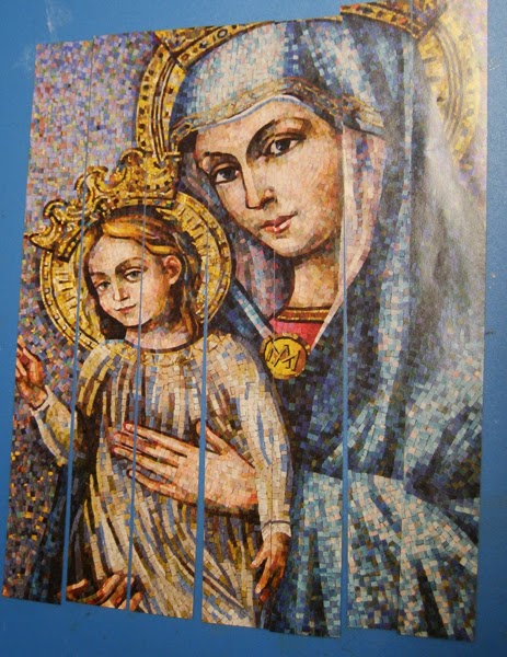
On one of my groups we are going to be having a 4"x 4" fat book page swap every month so for January we have been challenged to make covers for our books!  The theme for the swap is Shades of Colour.  After a bit of "sitting" with the concept I decided to use the following magazine cover to create my book covers. 
I loved this mosaic image as soon as I saw it on the cover of a magazine that arrived before Christmas!!  When it was time for the magazine to be recycled I tore off the cover not sure what I was going to be doing with it.
I cut off the text and cut the remainder into 1" squares.  

I sorted the squares into colour groups  - sixteen blueish ones for the front cover and sixteen  mulit-colour for the back cover.  I glued them to edge to edge onto white cardstock, pressed them under weight and trimmed them to just under a four inch square.
 I cut two 4"x 4" pieces of chipboard and glued my collages to them.  I used decorative packing tape to finish off the edges.


I cut the tape in two, adhered the white edge to the front of my covers and folded the remaining part with the letters to the back creating a nice collage on the inside covers as well.  I am super happy to have created art with this beautiful piece of paper that manages
to maintain the beauty of it without keeping the original context.  I love how you can see eyes, a mouth and fingers on the back without really knowing where they come from.
I will be binding my pages from the swap into the covers using my Zutter Bind it all machine using a large binding which will give me lots of room to add charms, fibers and tags if I wish.
I added ribbon and a 3D embellishment to my cover.  The embellishment is one I created when my grand daughter was visiting this summer. We played with bottle caps and I filled this one with a punchie that says, "Think HAPPY, BE happy".  I glued it to the cavity of a flatten bottle cap, added some clear Dimensional Magic and then inserted the blue iridescent beads all the way around the words and left it to dry.  The colours are a perfect match for my covers.  I used double side tape to adhere my ribbon to the outside and inside of my front cover and tied the ends together at the top.  I used an awl to make holes in my bottle cap and my covers then used coordinating thread to stitch it to my cover over the ribbon.
So the journey begins!!  I am looking forward to the swap and all the interesting pages I will receive this year.  As the cover says, we must think to be happy, nurturing the good that arrives in our lives and being grateful for every blessing is what will bring us happiness.
Enjoy what you love today!!

Therese

Thursday, January 08, 2015

Large cards with lovely little girl in pink & green!

I made theses cards for my monthly card exchange.  They are large 5"x 7" cards - I found some envelopes with flat cards in my stash and decided to use them up.
For each card, I started with a 5.5" x 4.25" piece of scrappy collage paper I created a while back.  I cut them in two so they would be large enough and added a layered tape border over the gap.  This tape - sort of like duct tape - arrived on my Christmas Secret Sister gift.  I was able to remove it intact so I saved it!!  The colours were perfect for these cards.  I glued those elements in place and went looking for images and greetings.  I found these two images of little girls by Lilac and Lavendar which I thought would do perfectly so I trimmed them to size and watercoloured them.  The greetings were in my stash - I layered them with colour coordinated label punchies (SU) which I cut in two so they would provide just a nice frame around them.  I glued the images in place over the tape border and added the layered greetings to the lower right.  I thought that the image on the pink card needed a bit of something so I added a gel pen faux stitching border.  I added a dotted line border with the same gel pen on the greeting on the green card for the same reason.   I love this colour combination!!

Therese

Monday, January 05, 2015

Teesha Moore inspired Postcard

I joined a postcard swap on one of my groups!!  The Theme: a raised letter A in Teesha Moore style!!  I started with a 4" x 6" lightly coloured alcohol ink background that I had in my stash.  I used my new Dylusions - Triangles -  stencil which I got for Christmas from my sister to add some texture on the right hand side.  I simply placed it over the background and sponged some inks through the holes - purple, green, teal & blue.

I punched the left hand side with a Fiskars ribbon slot punch, added some doodling around the holes using a fine tip Sharpie and then did all the way around the postcard edges using a wider black permanent marker. It added the contrast I like in my favorite Teesha Moore art. Then, I went looking for elements I could add to my collage.  I started with the chipboard "A" which fit right in and then found a cool sister poem on the gift tag I received from my sister this Christmas (will have to find out where she got it),  a teal coloured glittery heart, a little fairy girl and a couple of butterfly punchies.  These struck my fancy and complimented the colours of my background very nicely!!  I did sponge the poem with the same colours I had used on the stencil to get it to coordinate.
With my elements chosen I gave some thought to how I was going to add words.  Teesha often writes between the lines in her art so I drew wavy lines from the dips on my left hand border and added dots in between.  Really liked that!!  The border needed a bit more colour, so I used a variety of gel pens to colour in all around the slots.   That was better!!
I glued down my sisters poem and used 3D foam tape to adhere my "A" in place.  It needed a bit more contrast so I added some black doodling to it. The poem also needed a bit of something so I added some black dots on three sides and some drops of coordinating nail polish to the right hand side of it.   With those main elements in place I started adding words using a variety of hand lettering with a fine tipped Sharpie marker.  I started by adding "sister" next to my "A" and kept adding words and doodles between the lines.  I did get some inspiration for my lettering from Jenny Doh's book - Creative Lettering.  Once I had filled all the lines, I glued on my butterflies, the glittery heart and the fussy cut little girl.  I found the coordinating fiber in my stash which was off my sister's gift!!  It was so fun that I was able to incorporate so many elements that she gave me into this collage!!!  I tied the end of the fiber into the first slot and then cut it off.  Tied it into a different slot and cut it off.  I repeated the process until I had filled all the slots and no fiber remained - perfect!!  I really love how much texture it adds to the final piece.  I added another 4"x 6" postcard to the back and hand lettered "postcard", added a dividing line and little postage square in the corner.  I am very happy with my postcard!!!  We will be doing monthly postcards on the group - I am looking forward to doing more letters using different techniques.  You can check here to see the "R" postcard I made using the Tim Holtz January Tag as inspiration.
If you received some crafty items for Christmas, dig them out and use them!!  Get creative today!!

Therese