Showing posts with label distress inks. Show all posts

Sunday, February 18, 2018

Baby card with washi tape, sequins and a bit of watercolour

Another washi tape card!!  I sure am loving this design!!  I needed a card for a baptism today so I made up with baby one!!  I added green and blue distress ink my DIY foam stamp and stamped it onto my white cardstock which I had spritzed with a bit of water.  Quick and easy background!!  I added three strips of washi tape - the one on the left is commercial and the other two are handmade using coloured tissue/gift wrap and double sided tape.   I put the background in an embossing folder and manually embossed the edges using a hammer.  I watercoloured the laser printed die cut greeting (image font and regular font) and mounted it over the background using 3D foam tape.  I added sequins using double sided tape - five this time instead of the usual three.  I mounted this large element to a green card front. 
The congregation and the extended family were all invited to a potluck meal after mass and it was a wonderful time for everyone!! 

Therese

Friday, February 09, 2018

Some fun cards that feature washi tape, sequins and a die cut greeting


A couple more of these quick and easy cards that feature some washi tape which I made myself!!  You can check out the tutorial under TUTORIALS under my header. 
For the card on the left I decided to see if I could use a landscape format instead of portrait which I what I have used on all the other ones I made.  I think it worked out well!  The three washi tapes on this card were created using tissue paper and double sided tape!!  I used my foam stamp with green Distress ink to do a watercolour background, added three strips of washi tape and then used a hammer to manually emboss the edges using the Swiss Dots embossing folder (CB).  I mounted this background to a green card, added the watercoloured die cut greeting and a few sequins to finish it off!!  The greeting is a combination of fonts - one image font for the little bird and a regular one for the words.  These greetings were fun to make!! 
Pretty much ditto for the right hand card!  I used a warm linen Distress ink with a bit of green for the background, a swirl embossing folder for embossing the edges, a handmade washi tape with two commercial ones and then added the watercoloured die cut greeting and some sequins to finish up my card.  The greeting on this one is also made up of two fonts - one image font for the cup and a regular one for the words.  The left hand strip of washi tape was made using a piece of stamped sewing pattern tissue and some double sided tape. 
I hope you will consider giving this a try!  So much fun and you probably have the supplies on hand!!

Therese

Monday, February 05, 2018

Another washi tape and sequin card

For this card I used Distress ink for the watercolour background using my DIY foam stamp. I put on three strips of washi tape - the two on the right are commercial and the one on the left is handmade by me using red tissue paper and stamped with the stems from a flower stamp using black Versafine ink.  I really like how graphic and bold it looks!!  I manually embossed  some heart shapes using a heart embossing folder. and a hammer.  They I over embossed them with the Swiss Dot embossing folder (CB) and added texture all the way around.  I adhered this large layer to a red card front.  I fussy cut a laser printed chalkboard greeting and added two little heart rhinestones which I coloured with red Sharpies to coordinate with my card.  Add the greeting to my card using 3D foam tape and finished it off with three sequins that coordinated!!  I am really loving these fun cards!! I have a few more here and here and here.

Therese

Sunday, February 04, 2018

Washi tape, a stamped greeting and a few sequins over watercolour

I have experimenting with washi tape cards and here is another one!!  I used my DIY foam stamp to create the background using a blue Distress ink pad on white cardstock.  I stamped the little greeting in black Versafine ink once the background was dry.  I added three little strips of washi tape, two of which I made myself using double sided tape and tissue paper.   Love how it looks!  I watercoloured the greeting and added three little coordinating sequins before mounting the whole thing to a turquoise card front.   I don't believe I have ever used this stamp before so this last little cardmaking session has been good in getting the dust off some of my supplies!!!

Therese

Tuesday, September 06, 2016

Quick and easy - laser toner resist cards

I have been pondering ways of creating quick & easy cards and here is the first technique I worked out - laser toner resist!!  All of these cards use black toner from a laser printer as the resist along with waterbased colouring mediums.  All of the images are from CLKER.  I created the digital files using Corel Draw but any layout or word processing software could be used for laying them out and then printed them on 8.5" x 11" white cardstock.  I cut them into quarter sheets and then added colour!!  These first three have been coloured using SU watercolour pencils.  For the first one I applied the colour to a silicone craft sheet, spritzed it with water and placed my quarter sheet with the image facing down in the wet paint.  Worked out perfectly!  I wanted the words in the pink area.  I did add a bit of watercolour with the crayons to certain areas - outside edges, some greenery and a few flowers and then spread the colour with a wet paintbrush.
For the two butterflies I applied the crayons to the areas I wanted a specific colour and then spread the paint with a wet paintbrush.  I added the blue on the outside edges by colouring on my craft sheet with the crayon and then picking up the colour with a wet foam brush.  It gives a bit of a different look.   Really happy with how these turned out.  The fun is that these can be painted any colour!!  So, next time I print them out I can make cards that look different by choosing different colours and/or colouring mediums.  FUN!!
There is one missing from this set - it was printed in gray and I was not happy with the result of that one so it has been added to the serendipity stash bin.  I like the contrast of black with the colour much better and in some cases, it was beneficial to wipe them a bit after they are dry to remove any colour that remained on the laser printing.  These buckled a bit with the amount of water I had applied so I let them dry and pressed them under weight to flatten them. You could dry them more quickly with a heat gun and then press them.  To make the cards I trimmed the images to 4" x 5.25" and adhered them to a coordinating card front.


 For this set of cards I used one of the grungy CLKER backgrounds and added images and greetings. I did have to use images or fonts filled with white if I did not want the background to show through - for example, the rose and Happy Birthday.  The heart was transparent and the background shows through.

For these ones I used watercolour from a kids set and a foam brush, randomly adding strokes of colour that worked together until I was happy with the look of the piece.  I did add colour to the flower, the heart and the Happy Birthday afterwards with a smaller paintbrush to get them to stand out more.
 For this set I used Distress Ink pads applied directly to my silicone craft sheet, spritzed with water and then laid the cardstock into the puddle of paint with the image facing down.  I kept sopping up paint until I was happy with how it looked.   I really liked this process and it was possible to choose to place certain colours in specific areas.  I really wanted the top of the thank you card to be lighter and it turned out just like I wanted it to!!

UPDATE:  I have made a few more of these cards since this posting and have created a tutorial as well.  You can find the other cards here and here.   The tutorial is here or you can CLICK Tutorials above and scroll the the bottom of the list and click the link.

So this has been a fun experiment!!  I found it was relatively easy to create some artsy cards using white cardstock, some free digital images, my laser printer and some easily available colouring mediums.  The kids sets of watercolours are on sale at this time of the year and will provide colour for hundreds of cards.
I challenge you to give it a try and let me know how it works out for you!!  Leave me a comment with a link to your creations and I will go and check them out!!

Therese

Saturday, January 03, 2015

Tim Holtz January Tag Challenge

Happy New Year!!
Wishing you and yours every blessing in 2015!!

It has been a busy holiday season with not too much creative time but I did manage some crafting today.
On one of my groups we are considering a Tim Holtz monthly tag swap or challenge so I decided to see what I could create in the creative spirit of  Tim Holtz's January Tag!  I was not interested in copying his tag exactly so I decided to do a 4"x 6" postcard instead and liberally substituted what I had for what he used in the way of product and put my own spin on the elements as well.  I made a list before I headed to the craft room - tissue paper, paint, distress stains or spray, words, metal embellishments, glitter and seam binding which was my guide to the products which he used.
Tissue paper - I do have a wonderful piece of TH tissue paper which was gifted to me by my altered cuff swap partner and I set it aside in a "safe" place so I could use it for a project just like this.  Needless, to say today when
I could have used it, it was no where to be found.  I eventually gave up and dug out a piece of sewing pattern tissue and stamped it with a background newspaper stamp (IO) in black permanent ink to create tissue paper for my project. I could have chosen to create more of a collage look by choosing a variety of stamps instead.  I am happy with what I produced.  I did stamp a much larger piece than I needed so I will have some for future projects.
 I started with a 4"x 6" glossy photo paper which I washed with some gray watercolour.  I have a few of these colour palettes which I used previously for classes that I will be using up in my projects this year in a effort of using up what I have.


I applied glue to the whole front of my postcard, laid my piece of tissue over it and burnished it well.  Once it was dry, I trimmed all the way around with my scissors.  I chose a piece of tissue that was not too busy and featured only a few of the original lines on the sewing pattern.


Paint was the next item that Tim Holtz used, so I just added some colour using the watercolour palette I had sitting there - mostly red and oranges.
Next, I went looking for distress stains or sprays.  I had purchased vintage inks from Stampin Up a while back and thought they would do nicely for the spritzing I needed to do next.  I mixed up some mahogany which turned out to not be as red as I had expected and then dried lighter.  I chose Tea Stain (SU) next and found that it just blended into the surface and did not show up at all.  Needing to add a bit of colour I decided to use Charcoal.  That did the trick - it added colour in some very nice splotchy areas along with some nice spattered sections. Just what I needed.  I tend to mix sprays as I need them instead of having some on hand.  I admit that it means that I don't use them as often.  Maybe this year I will use them more often by mixing more than I need and leaving it in the spritzer for next time.
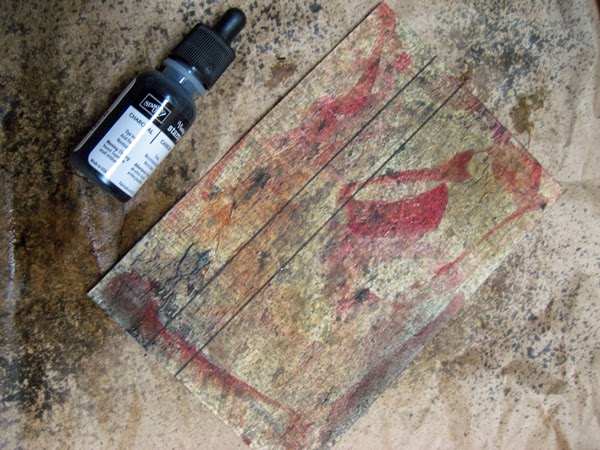


While the sprays were drying, I went looking for the other items I needed.  I found stamped words (SU) in my greetings bucket which I cut apart and trimmed.  I found a chipboard R which will work for one of my postcard swaps - bonus! Found some metal screening and a TH "wonderful" metal tag and decided that my next element should be a "U" which I die cut from shiny silver cardstock using a SU alphabet die.  When I checked the list I still needed glitter
and seam binding so checked my heart bucket and found a red glittered heart and my stash of vintage seam binding and found some coordinating red seam binding which I had dyed for a previous project which was perfect.  I used a permanent black marker on the chipboard "R" - completely covering up the bright pink!!  Perfect!!
Once my postcard was dry I arranged my words, letters, red glitter heart and the metal embellishments.  I decided to tie the seam binding to the R which worked in all of my elements.  Once everything had a home I glued the words in place.  I used three black diamond brads to attach the silver metal screening,  a vintage gold brad to attach the round TH "wonderful" embellishment and three black mini brads to attach my "U".  I tied a short length of the red seam binding to the stem of the "R" using a double knot, attached it with 3D foam tape and tucked the seam binding ends in around the "U".  The glittered red heart was added using double sided tape.  The words seemed too stark so I used the same gray watercolour I had used on the postcard front and added several light washes to tone them down a bit. I also added a bit of black to some of them to better define their edges.
I am very happy with my postcard and having used the "R" I can use it for the postcard swap for the end of the month!!  So, a good use of my crafting time today as I managed to get the TH tag challenge done in the same project as the "R" postcard swap!!

Therese

Wednesday, June 25, 2014

Anniversary card with love birds

A card for my DH for our anniversary!!  The bird cage image was downloaded off of The Graphic Fairy.  I modified it a while back and added my own digital love birds.  For this card, the combined images were printed on white cardstock and watercoloured. I added some Vintage Linen distress ink to the frame before I stitched it to the vintage image.  I embellished the laser printed greeting with watercolour, punched a hole on one end and flagged the other.  I tied a string into the hole and wrapped the long end around this focal element several times and tied the ends near the tag.  I attached the whole element to my blue green card front using double sided tape.  The greeting needed a bit of something so I added a little heart rhinestone which I coloured with a sharpie to be a coordinating colour.

Therese

Saturday, June 14, 2014

Father's Day card with a cabin

I have managed to use quite a few of these frames in the last little while!! In this case, I used it to frame a watercoloured image of a cabin.  The cabin is one that I received in a swap years ago and I thought it would be appropriate for my Dad for Father's Day. I added some Vintage Photo distress ink to the frame before I stitched it to the image.  Aterwards, I stitched the whole element to a dark brown card front.  I embellished a laser printed greeting with watercolour and used staples to attach it to my card.

Therese

Tuesday, June 03, 2014

Travelogue book for a swap

 I joined a book swap on AFTCM that required that we create a Travelogue. I googled Travelogue to see what exactly that meant and found that it is a book that records the details of a trip. So, I created a book that will do just that!  It is appropriate for almost any trip - camping at the lake this summer to visiting a foreign country for the first time.
 I started by creating the paper for the pages.  I used TH Distressed ink pads, a non stick craft sheet, a spray bottle of water and several sheets of glossy photo paper (4"x 6").  I applied three or four colours of ink to the craft sheet in a random pattern, spritz it with water and placed the photo paper glossy side down into the ink.  I continued to spritz and apply the paper until I was happy with the look.  I was able to make 2-3 sheets with each inking.  I laid them all out and once they were dry I matched them up to create the pages of my book - six sets of two.
I brainstormed some words that would be appropriate for my pages and decided on twelve that would work for almost any trip.  I drew a fancy "I" along with one word on each page using a fine tip Sharpie.  I used my Creative Lettering book by Jenny Doh for inspiration for my "I"s.  I added dots to create guidelines to aid in adding the trip details on each page.  I was careful not to draw too close to the edges knowing I needed room for stitching and binding.  As I blogged these images I see that I forgot the dots on two pages!  Already fixed!!

I found ribbons that coordinated with each set of pages, placed them on the right hand side in between the two sheets and stitched the two together using black thread in my sewing machine.  I spaced the ribbons so they would all be visible when the book was closed.  Stitching them together created pockets which can be used to store ephemera from the trip. I added an arrow and a half circle punch out to highlight the pockets. The pages still needed a " bit of something" so I used a floral stamp to add some flourishes to each page.  Just what they needed.
I worked out my binding pattern and punched 1/16" holes on each set of pages to coordinate with my pattern.  I used black cotton thread to tie together two sets of pages 1 & 6, 2 & 5, 3 & 4 leaving a bit of a gap between them. Then, I worked on my covers.  I used two pieces of medium weight chipboard from my stash cut to size and bound them to each other by stitching a piece of wide grosgrain ribbon (ends stitched together) between the two pieces.  Made a very neat binding


 I then stacked my three sets of pages one on top of the other, in order, and used a needle and black cotton thread to stitch and tie off each of my six page bindings to my grosgrain binding on my covers. Worked wonderfully!! I have a book that opens wide with a very streamlined binding.

I hand lettered the words for the cover onto a spare piece of decorated photo paper and tied on a metal heart embellishment (earring dangly).  I did some doodling on the chipboard cover using black Sharpies before stitching the decorative element to the front cover using black thread.
I added yet more doodling to the front cover until I was happy with the contrast of the lines and the weight of the lettering.  
 I decided to use the little half circles I had left over from punching my pages to decorate my back cover. I matched them up, glued them into place and used my fine tip Sharpie to add some doodling around them.
 After, checking out all the pages I decided to add a bit of doodling to each half circle opening that I had punched out and added a couple of images in the pockets!!
There is a lot of room in this Travelogue book for my swap partner to make it their own.  I hope they add yet more doodles - lots of room on the pages and the back cover!! I hope they enjoy their trip and add details as they travel to create for themselves a wonderful little book of memories.

Therese

Sunday, May 25, 2014

Two more cards created with ATCs


I am still working on getting some cards made with my large collection of ATCs.   Here are a few more.
I used an ATC from a technique swap for this first card.  It was created using rusted metals.  I really like its arty look.  I found the embossed kraft frame in my stash and decided I could make them work as the major components for my card.  I used Aged Wood distress ink to highlight the embossing on the frame and then stitched it to my gray card front using black thread.  I added the ATC using homemade washi tape that was a similar colour to one in the ATC. Next, I added a colour washed laser printed greeting between the ATC and the card front.  It still needed a bit of something so I went digging into the stash looking for a 3D embellishment that might work. When I found this mangled bottle cap I thought it was perfect.  I found it on the ground somewhere along the way when I was out for a walk.  I made a hole in it with my awl and then attached it to my card front using a tiny pewter brad.  Done!!
I love the grungy look of this card!!


Here is the other card I made.  I used another of the kraft frames I had on hand and used blue/green ink on it instead.  I glued it to a blue card front, added some embossed mesh (window screening) on both the left and right sides using double sided tape and then glued the ATC over them centered in the opening.  The ATC was created on handmade paper using dimensional paint and mica powders.  I added a layered greeting below the ATC.

I am really enjoying working with ATCs.  They make wonderful cards!!  The perfect focal elements!!

Do you have a stash of ATCs that need to find a new home??

Therese

Thursday, February 27, 2014

Doodled Tags

 I created these tags to accompany some pencil cases I have made that will serve as silent auction prizes at our family reunion this summer.  I die cut them using a Trio Tags die (SX) from heavy weight chipboard which was merchandise packaging.  I painted the back side and added my name and blog address in sharpie marker.
 I coloured the fronts using distress ink pads in coordinating colours and then added some doodling with a fine tip sharpie marker.  I ran a large permanent marker all the way around the edges to define the edge and finish off the designs.  Finally, I sprayed them with hair spray to seal the surface.
You can see here that I tied them onto my pencil cases using black cotton thread.
It was fun to create the pencil cases with the gorgeous butterfly fabric I scored at the thrift shop a couple of weeks ago and now they have one of a kind tags as well.  I am happy!!

Therese

Wednesday, October 20, 2010

Clear embossing powder resist


Another resist technique!! In this case, I used clear embossing powder as the resist. Stamped the image with Versamark on white coated paper and clear embossed. After some experimentation, I went with Distress inks on these backgrounds. I applied the ink in a circular manner with the pads directly to the paper, rubbed it lightly with a dampened paper towel which softened the inks very nicely and somewhat removed the ink from the clear embossed image. I did go back in with a barely damp paper towel and remove yet more ink from the embossing powder. I think classic dye inks might have worked better for this purpose but I was really liking the look of the distressed inks!!


Thrifty Tip: I did spritz the paper towels after I was done and wadded them up to disperse the inks which works so well with the distress inks. Colourful decorative papers to be used another time!!
I layered the birdie images with a white cardstock layer to which I attached, with double sided tape, a little piece of eyelet trim. Finished it off with a colour printed greeting attached with 3D foam taper. I created the greeting in a layout program (Corel Draw) so it could be punched with my large oval punch (SU). It is a great way to create custom greetings and gives you a wide variety of colour options especially useful when you have a limited amount of stamp pads!!

Therese